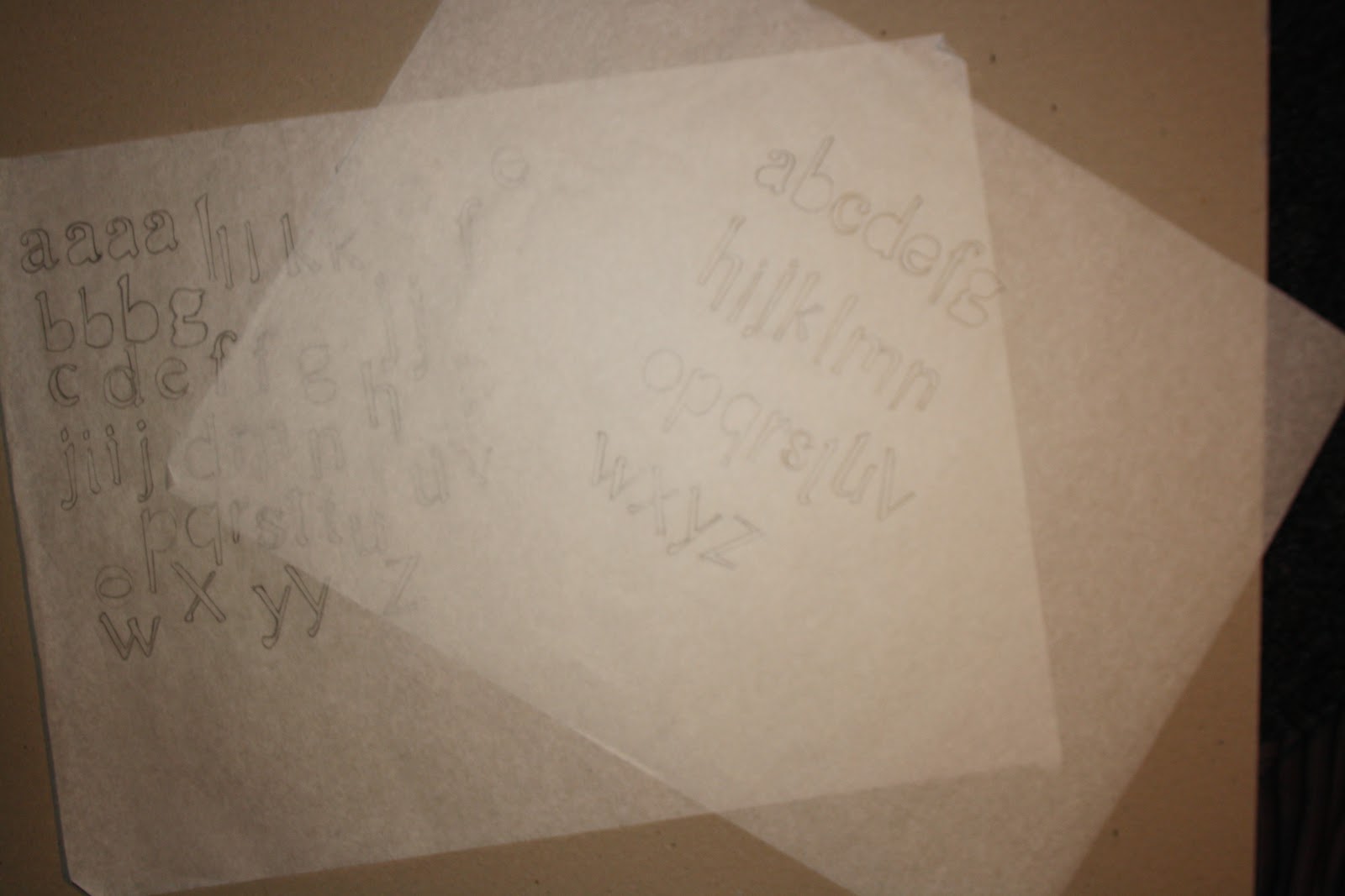


This is the Development of creating my lowercase alphabet, trying different variations of the same letter form.

I began making changes by trying my alphabet in lower case, to see what it would look like and personally i thought in lower case it suited her personally a lot better i also put a shadow behind the letter which i feel gave it more character.


I then started experimenting with different colours to see if it changed any thing and i think with colour again adds more personality.

I decided to stick with this colour because i feel it related to her more.
No comments:
Post a Comment